BORRIS GROUP
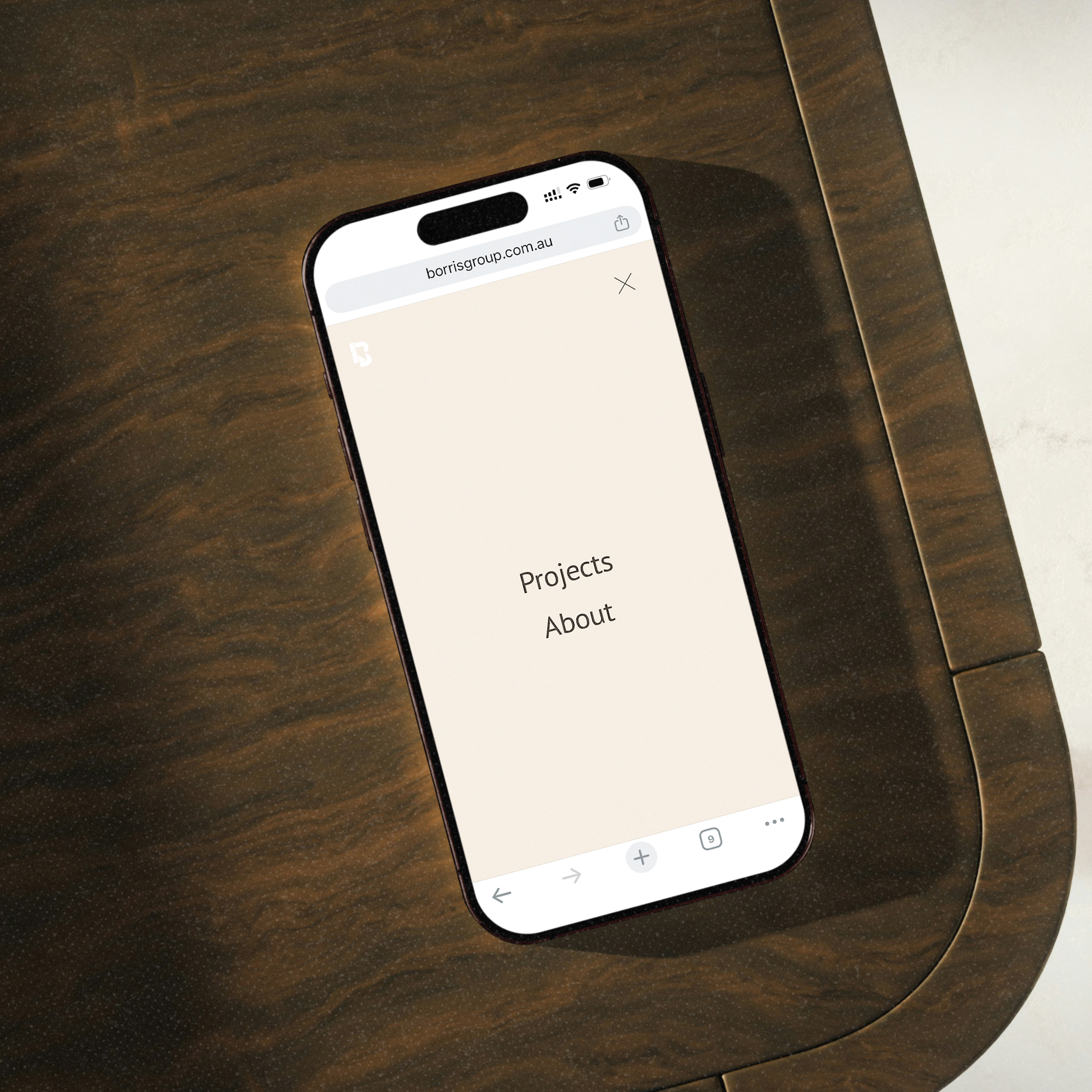
Borris is a master builder and the face of his business, so the brief called for a logo that works first and foremost as clear identification. I was engaged to create a brand identity that feels as solid and straightforward as the materials he builds with, and to carry that through a logo suite, website, photography, business cards, window decal and site signage.
Every shape in the mark sits on a grid based on the golden ratio and shared geometry. The curves of the b soften the harder angles, so the logo feels calm and grounded rather than severe. This measured approach mirrors good building practice where alignment, proportion and structure matter more than decoration. At small sizes the symbol still reads cleanly and quickly, which suits site signage, social avatars and vehicle branding.
The colour palette takes its cues from stone and concrete with warmer notes that suggest timber and clay, giving the brand a quiet, earthy presence. Together these elements present Borris Group as capable, practical and dependable, with a logo that verifies his presence online and out on site at a glance.