Lumen ONE
Lumen is a health and wellness startup developing high-polyphenol olive oil as a daily supplement.
The initial brief was to design a label for a bitter, high-strength olive oil intended to be taken neat or added to smoothies and coffee. The challenge was to make the product feel premium and artisanal without losing the clean, structured quality of a science-led wellness brand.
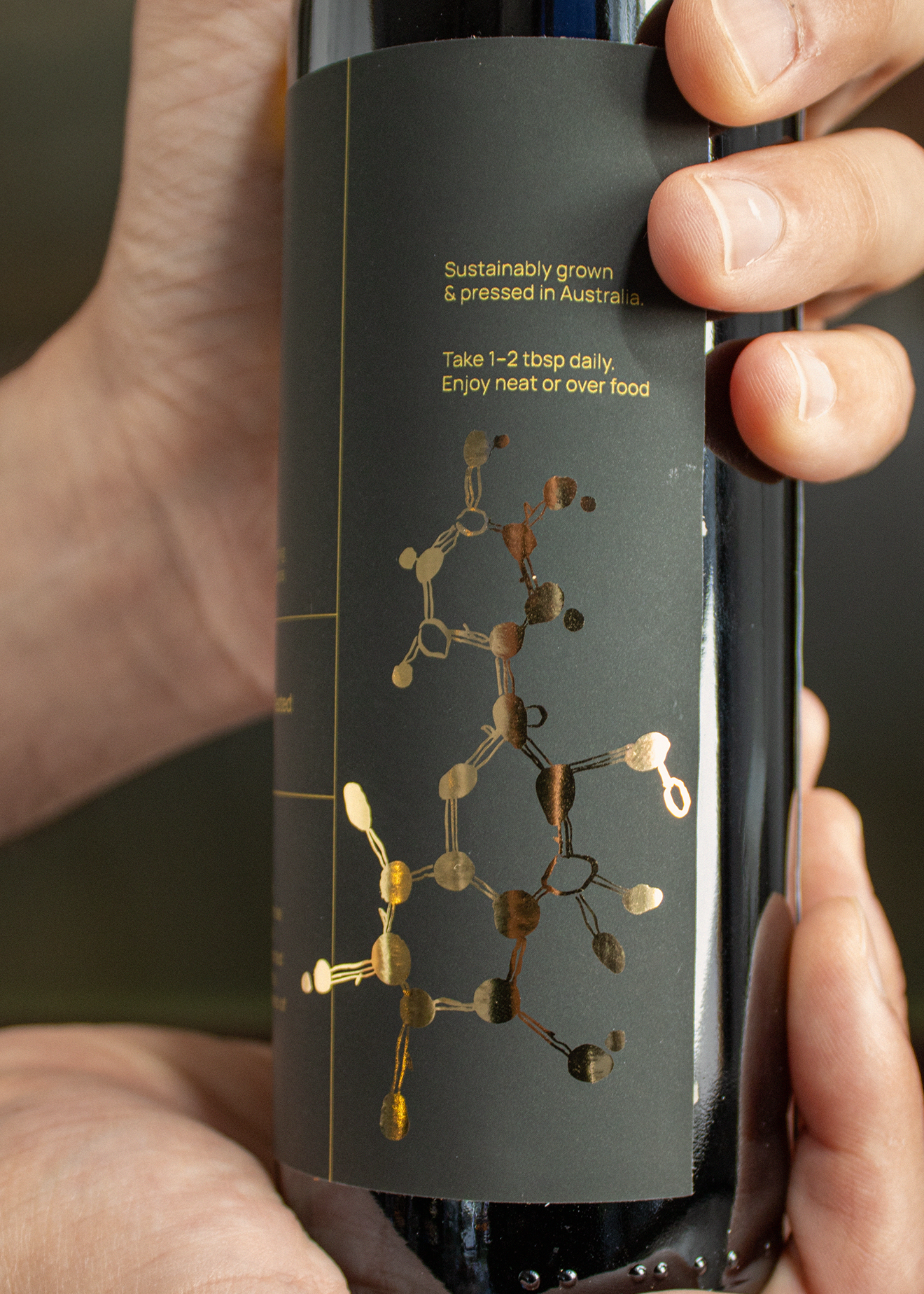
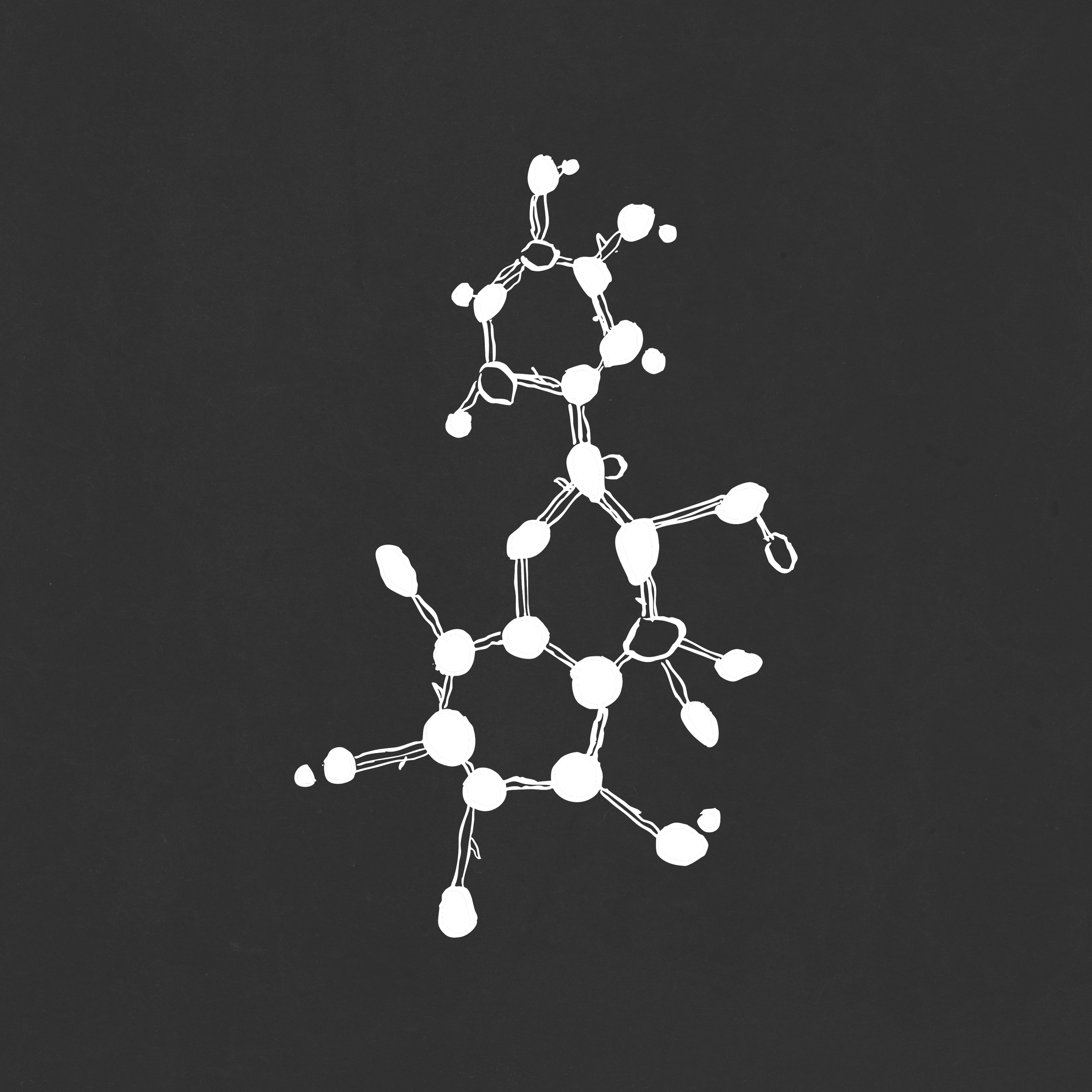
I developed a minimal label system using a hand-drawn polyphenol chemical structure as the central visual device. The illustration references the product’s active compound, while the atom joins are subtly shaped like olives. Finished in gold foil, the drawing gave the packaging a refined, tactile quality without relying on heritage cues.
The identity was later extended across supporting assets, including an insert card designed to sit inside the packaging. Developed with the brand’s marketer, the card encouraged a daily ritual around the product, with messaging centered on small, consistent acts of health.
I also worked closely with the founders to develop the Lumen logo. The process explored ideas of illumination, transparency, chemistry and longevity. The final mark uses a clean typographic approach with an interlocking hexagonal motif, suggesting molecular structure while remaining open, clear and legible.
The first batch of olive oil sold out, with customer feedback often noting the beauty of the packaging. The project gave Lumen a considered identity system that the founders could confidently grow with.